Last year when I switched to Pocket Casts for all my (cross-platform) podcast needs, I released a purple version of the official app icon, because, well, thanks to Apple Podcasts my brain is hardwired to think of podcasts as purple.
![]()
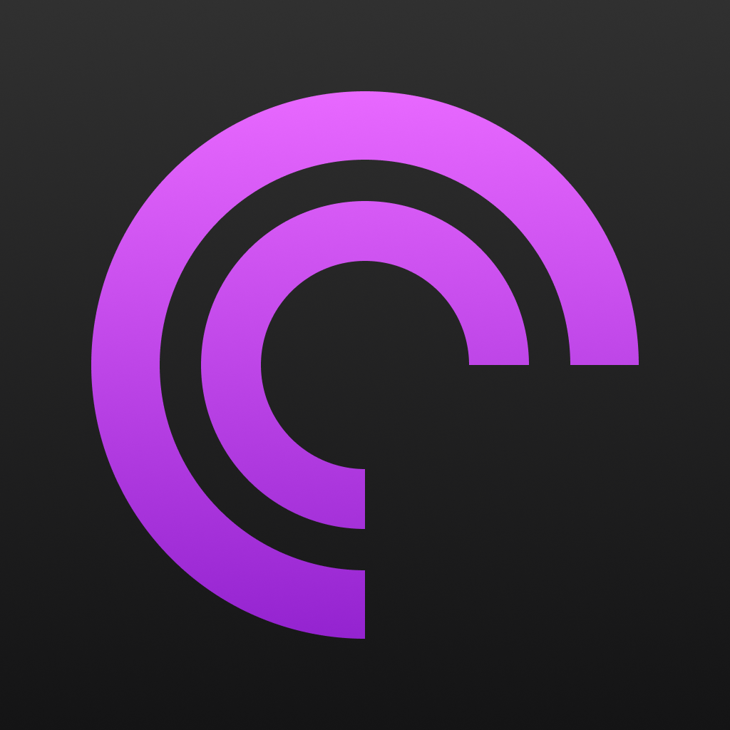
When iOS 18 came out on Monday with support for alternative dark app icons, I quickly realized that my purple Pocket Casts icon wasn’t really working there. So I went back to the Apple Podcasts app, which now only shows a purple icon on a dark gradient for dark mode. And so I updated my icon with the same style – here’s my purple Pocket Casts icon for dark mode.
![]()
And while I was creating the icon, I noticed that the alternative „Reeder 4“ icon, that I have always used as the icon for Reeder 5 (now „Reeder Classic“), didn’t quite match the dark mode either. So I just changed it, here is the slightly darker Reeder 4 icon.

@eay Ich stell mich mal ganz doof: Wie haste die dann eingebunden? Und sind die nach jedem Update der jeweiligen App wieder futsch?
@el flojo: Über einen Custom Shortcut in der Shortcuts/Kurzbefehle-App, der nichts anderes macht als die gewünschte App, hier also Pocket Casts, zu öffnen. Shortcuts kann man sich dann auf den Homescreen mit einem Bild seiner Wahl legen, wie eben die alternativen Icons. Siehe z.B. hier für eine Schritt-für-Schritt-Anleitung: https://www.theverge.com/22529978/apple-iphone-ios-apps-icon-change
Bleibt dann auch unabhängig von App-Updates bestehen.
Danke für die Icons, sieht hammer aus!
Ein dunkles Icon für die WetterOnline App wäre noch mega. Falls jemand Lust hat 😂