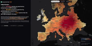
#visualisierung

Notable People

The map is showing birthplaces of the most „notable people“ around the world. Data has been processed to show only one person for each unique geographic location with the highest notability rank.

Interessante Karte von Topi Tjukanov, die für jeden Ort, die prominenteste Person anzeigt. Bei uns und in den umliegenden Ortschaften sind es vor allem protestantische Märtyrer, die im Mittelalter zum Tode verurteilt wurden, eine Olympiasiegerin und ein Religions­wissen­schaftler, mit dessen Mutter meine Oma befreundet war. 🤷🏻‍♂️ (via Thomas Gigold)

A Time-Lapse Map of Every Death From the Coronavirus Pandemic

 
(YouTube Direktlink)

This is an audio-visual time-lapse of every death from the Coronavirus pandemic from January to June 2020. […] Each country is represented by a tone and an expanding blip on the map when a death from Covid-19 is recorded. Each day is 4 seconds long, and at the top of the screen is the date and a counter showing the total numbers of deaths.

Eine sehr eindringliche, bedrückende Arbeit vom Komponisten James Beckwith, die in 13 Minuten alle Coronavirus-bedingten Tode von Anfang Januar bis Ende Juni visualisiert und auditiv erlebbar macht. Und von der es wohl leider eine Fortsetzung geben wird:

The virus grows continuing to work its way throughout the world until the end of June – where this piece ends but the real virus has not. At the time of writing this Covid-19 has claimed over 500,000 deaths worldwide. It is likely a sequel will need to be made.

(via Kottke)