A legible monospace font… the very typeface you’ve been trained to recognize since childhood.
(via @kobaltauge)

Das Weblog von Stefan Grund, der im Netz als @eay unterwegs ist und hier seit 2003 über Medien, Popkultur und Technologie schreibt. Mehr »
A legible monospace font… the very typeface you’ve been trained to recognize since childhood.
(via @kobaltauge)
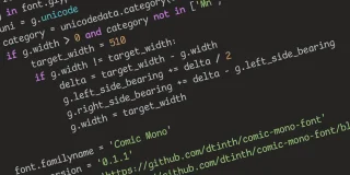
A legible monospace font… the very typeface you’ve been trained to recognize since childhood
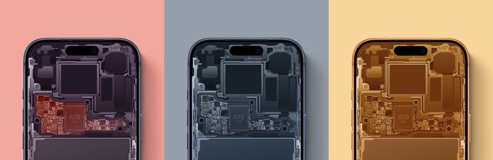
Der Basic Apple Guy hat die diesjährige Fassung seiner beliebten Internals-Wallpaper veröffentlicht.
Nach der Umbenennung hier nun die neuen Visuals. Das Sound Design stammt von Finneas.
Update, 07.11.: Eine überraschende Ergänzung: Das Intro ist, wie Apple selbst angibt und in diesem Video zeigt, „Made by hand“ – und nicht rein im Digitalen entstanden.

S.E.L.A. is an archive of logos related to the world of Space Exploration. The collection spans more than 80 years of works and includes the most iconic and noteworthy logos distributed in seven chapters, starting with the best known up to the raw & rare ones.
Tolles Projekt1 von Davide Mascioli, das auch zu einem bereits Kickstarter-finanzierten Buch geworden ist. (via Kottke)

Speaking of Liquid Glass: Schöne Zusammenstellung von Vorher/Nachher-Bildern bei The Verge. Diese neue Option hätte von Anfang an der Default sein sollen.
The interface is restless, needy, less predictable, less legible, and constantly pulling focus rather than supporting seamless access to content. Instead of smoothing the path for everyday tasks, iOS 26 makes users relearn basics while enduring a constant parade of visual stunts.
Raluca Budiu von der Nielsen Norman Group, einem der weltweit bekanntesten Beratungsunternehmen für User Experience, Usability und Interaction Design, ist alles andere als begeistert, was Liquid Glass angeht. (via vowe)
iOS 26’s visual language obscures content instead of letting it take the spotlight. New (but not always better) design patterns replace established conventions.

Cosmic Orange, now available for the unprofessional.
Already own a Cosmic Orange iPhone? Good news: our flawlessly colormatched knock-off is available for hundreds of other devices. Whether you own a MacBook or some other, more reasonably-priced hardware, it can now cosplay as an iPhone 17 Pro Max. Nobody tell Tim.
Speaking of Liquid Glass, hier ein hervorragendes, 10 minütiges Video vom empfehlenswerten YouTube-Channel Design Lovers von Ilia Werner über die Geschichte von durchsichtigen, glasähnlichen Interface-Designs: von OS Xs Aqua zu Windows Vistas Aero bis heute.

Craig Hockenberry, seineszeichens Entwickler bei der Iconfactory, fragt sich, warum es Apples neue Designsprache, Liquid Glass, überhaupt braucht:
I’m unaware of anyone outside of Apple who’s thinking “we really need to have more fluid glass in our designs”. Of particular note during the introduction is how much time they spend showing off glass blocks and talking about the physical effect itself. While not addressing the most important question: “why do we need this?”
And I’m pretty sure the answer is “we don’t”. The answer is “Apple does.”
Seine Vermutung: Apple braucht es, weil künftige Hardware besser damit funktionieren und harmonieren wird. Etwa weil die Bezels immer kleiner werden und Flexible OLEDs den Übergang zwischen Rahmen und Software weiter verschwinden lassen werden.
Da ist sicher – auch in Anbetracht des iPhone 17 Air – einiges dran. Hauptsächlich liegt Liquid Glass aber meines Erachtens in einem vergangenen, bereits releasten Produkt. Nämlich der Apple Vision Pro, die vor über anderthalb Jahr erschien, aber nicht annähernd so abgehoben ist wie Apple das antizipiert hat. Dennoch wurde hier die Designrichtung bereits in die Wege geleitet, und kommende Virtual- oder Augmented-Reality-Produkte von Apple werden – im Formfaktor einer regulären Brille –, wie gemacht für flüssiges Glas sein. Mehr in your face geht es eigentlich nicht. Literally.

Whether you love it or hate it, there is no shortage of opinion on Liquid Glass. I have thoughts about what it is, but today I want to focus on why it exists. Apple’s public rationale for the new design language is that it offers a universal solution across platforms that takes advantage of rec...
Apple could very easily keep the icon’s historical appearance without compromising the Liquid Glass aesthetic by just… flipping the color palette.
Viel besser.
Update, 24.06.: macOS Tahoe Beta 2 macht es dem hiesigen Finder-Entwurf nach und entschärft die Liquid-Glass-ificiation™ dadurch natürlich, hat aber dennoch einige Probleme.
I would like to present, in response to the widely criticized Finder icon in macOS Tahoe Developer Beta 1, the icon I created in literally fifteen minutes.